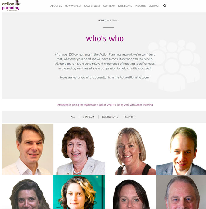
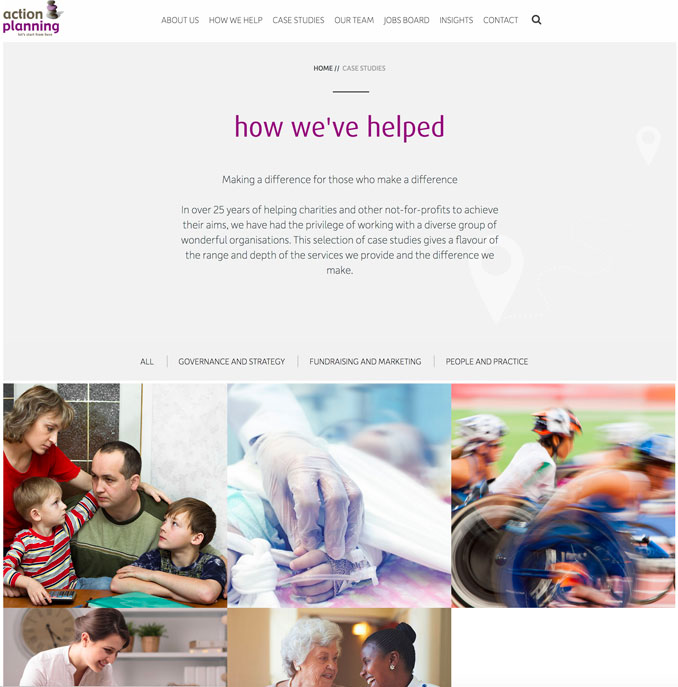
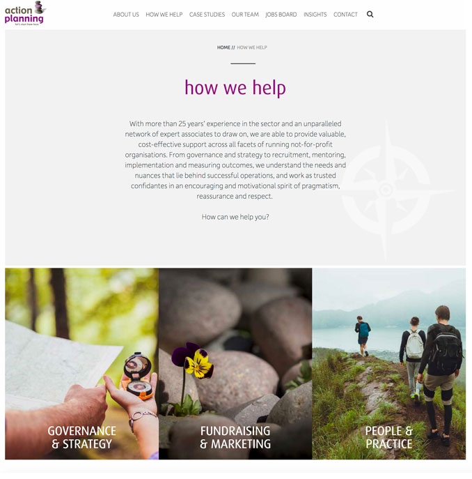
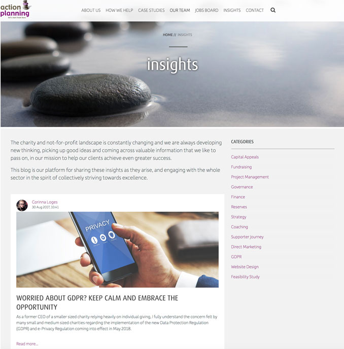
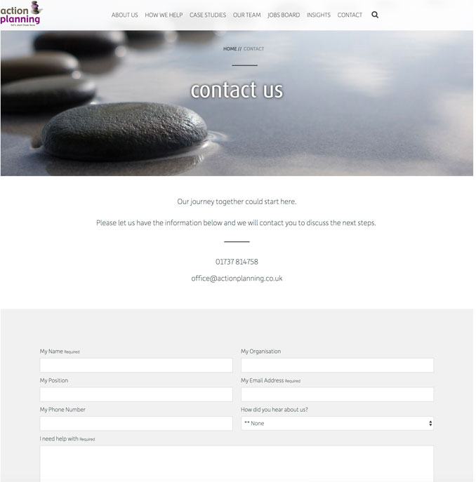
Discovering what lies beneath a rebranding brief comes from our proven process of frank and open interviews with key staff where we prospect for gold, digging around until eventually that glint of an idea unfolds to become the keystone for the whole brand. When we began work with specialist charity consultancy Action Planning, this process really worked so well that not only did we start to get under the skin of the company, but they started to see themselves in a new light too. This prompted a new vision for Action Planning and a clearer way of thinking about the services they offered and what the benefits were to their own clients from using these services.
Our approach throughout the entire rebrand was straight talking with a real desire to uncover the true essence of the company which crystallised in the concept of a journey. What we found time and time again was that no matter where a charity was on its path, Action Planning had the expertise to offer advice and could act as a guide along the way. We symbolised this through the use of a waymark image, a simple stack of stones which marks a point on a route. This combined with the strapline 'let's start from here' and images of paths became their brand identity.